
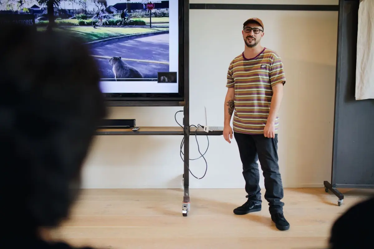
Nervous about your first slot at a camera club or meetup? Here’s how to give a photography talk: pick one clear message, plan the structure before the slides, keep slides simple, and rehearse several times.
This guide sits inside the wider collection on london photography talks, and it is written for first-time speakers.
| Item | Guideline |
|---|---|
| Minimum slide font size | 16-point, preferably 24 or larger |
| Text per slide | No more than six to seven lines of text or bullets |
| Time per slide | Roughly 2 minutes per slide |
| Full run-throughs of the talk | 3-4 times |
| Run-throughs of the first few slides | 5-10 times |
| Screen edges to keep clear of key content | Outer 5% of the screen |
These figures come from the Brandeis Science Communication Lab quick tips and Columbia University’s hints for technical talks. They are general presentation guidelines and can change, so check the source before you rely on them.
Start with your audience and one clear message
Before you choose a single photograph, decide who the talk is for. A university communication lab notes that different audiences pay attention to different things, so a room of beginners needs different examples from a room of experienced photographers (MIT Communication Lab).
The Brandeis lab puts it plainly: the presentation is for the audience, not for you. For a photographer, that means choosing the single message you want people to remember, such as how you approach a project, rather than showing everything you have shot.
If you are still looking for a subject, the guide to photography talk topics is a good place to start.
Plan the structure before you open the slides
A common pitfall is to start with the slides first and then rearrange and restructure them, according to the MIT Communication Lab. Plan on paper first, then build. A talk, says a University of Amsterdam guide, needs a beginning, a middle, and an end.
A simple shape for a photography talk looks like this:
- Opening: say in a sentence or two what the talk is about and why it matters to this audience.
- Roadmap: tell people what you will cover so they can follow along.
- Core: show the work and the story behind it, a small number of examples at a time.
- Closing: restate the message you want people to take home.
Keep the roadmap short. The MIT lab suggests a rule of thumb of 2-5 points and no sub-points.
Work out your slide count from your time slot. One guide suggests you figure on roughly 2 minutes/slide, while one academic speaker aims for around 12 slides for a 20-minute conference talk. Treat both as starting points and test them when you rehearse.
Design slides that let your photographs do the work
Your slides are a visual support to help the audience follow what you are saying, not a replacement for you. Brandeis advises you to keep text to a minimum and tell your story with images, which suits a photographer well.
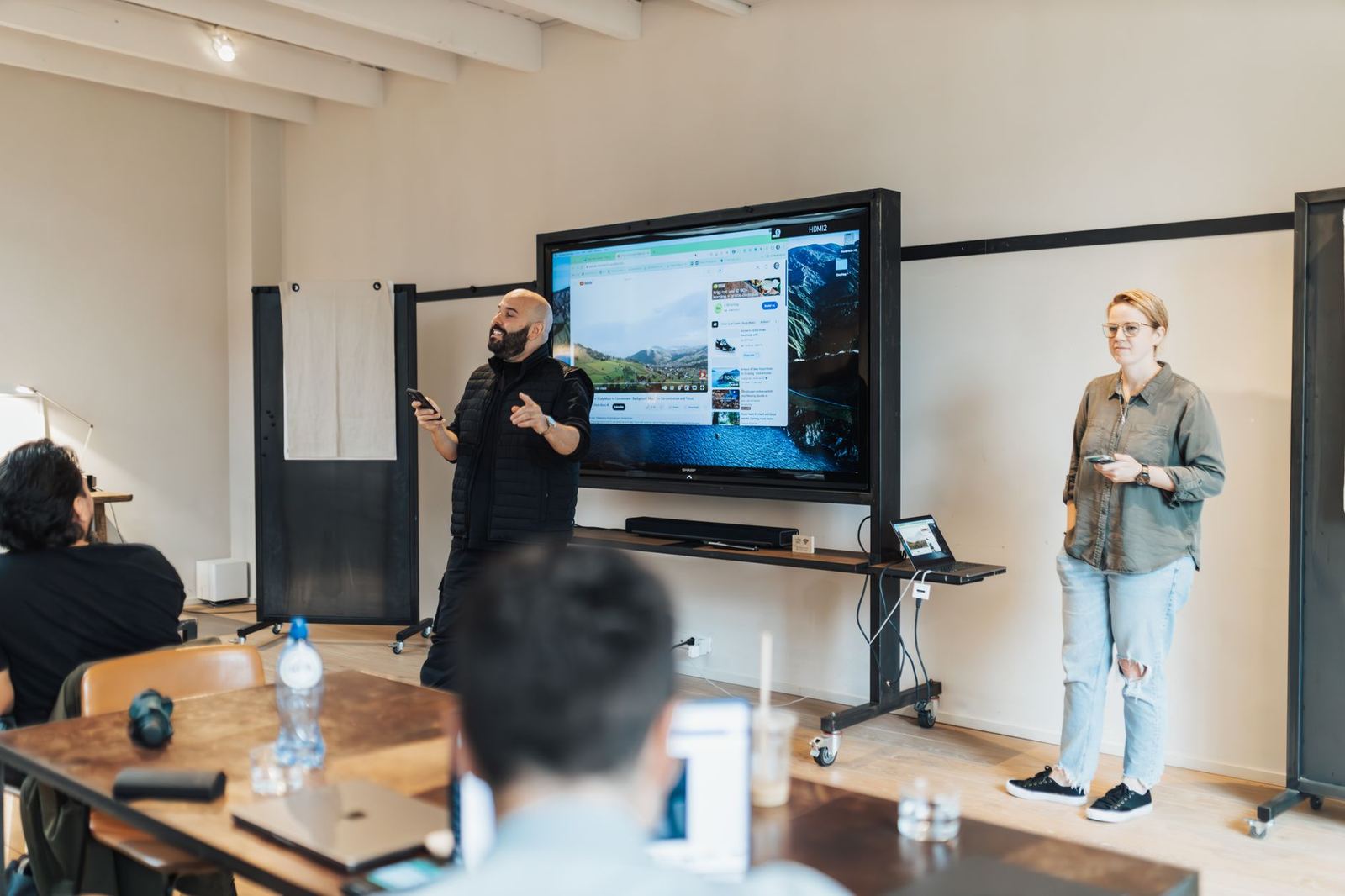
Run through this checklist when you build the deck:
- Aspect ratio: 16:9 works on most projectors and suits online presentations, but you can ask the organiser what the room uses.
- Type size: 16-point at a minimum, preferably 24 or larger.
- Safe margins: the same lab says not to draw anything important on the outer 5% of the screen edges, so keep captions and credits inside that line (Brandeis).
- Text volume: no more than six to seven lines of text or bullets on any slide.
- One point per slide: make a single point per slide so you control the pace.
You do not need a bespoke design. One designer-speaker says there is no shame in using a generic theme when you start.
Think about the room before choosing a dark theme. The same author notes that dark themes work for dark rooms, but that if you are not a designer it can be hard to make readable dark slides that work nicely with pictures.
Rehearse, and plan for things going wrong
Brandeis suggests you practice the entire talk 3-4 times and the first few slides 5-10 times. Rehearsing with plain skeleton slides first helps too: one speaker designs only afterwards, which avoids designing slides you won’t use.
Then prepare a fallback for the room. Useful backups include:
- A copy of your slides on a USB memory stick and a web page.
- A PDF version, so you can ask whether you could still give your talk from a PDF if the audio or internet fails.
- A recording of any live demo, since the same source says that if you planned a live demo, record it in advance.
Timing and how you handle questions are part of good photography talk etiquette, which is worth reading before the day.
Delivering the talk on the day
Slow down. Columbia’s advice is to speak slower than you think you have to, and a presentation-software company’s guide agrees that nervous speakers rush.
Talk to the room rather than the screen. Do not read from the slide, and look in the direction of different people as you speak. Carry brief keyword notes instead of a script, because memorizing your entire presentation increases anxiety rather than reducing it.
Make your final slide count. The University of Amsterdam guide says to use your final slide to get across your main message once more, since it stays on screen through the question period.
Frequently asked questions
How many slides do I need?
Show answer
It depends on your pace and style. As starting points, one guide says to figure on roughly 2 minutes per slide, and rehearsal will show whether that suits you.
How many times should I rehearse?
Show answer
Brandeis suggests 3-4 run-throughs of the whole talk and 5-10 of the first few slides. The opening is where nerves hit hardest, so it gets the extra practice.
What if the projector or wifi fails?
Show answer
Carry a backup copy of your slides, ideally a PDF, and record any live demo beforehand. Planning a “lower” version of the talk means a technical fault is an annoyance rather than a disaster.
Do I need to be a designer?
Show answer
No. A speaker who teaches slide design says there is no shame in using a generic theme when you start, and your photographs will carry most of the visual weight.